

18/02/2025
Trying to navigate a world where reading signage is either difficult or impossible can leave some audiences at a disadvantage. This is a challenge for brands who value inclusivity, diversity, and equality. Thankfully, a few simple signage techniques can help to eradicate the potential anxiety of the retail experience, supporting existing audiences and encouraging new brand devotees. Here’s how.

Multi-sensory
We often think of signage as being two-dimensional. However, it doesn’t have to be. Experienced design companies with access to innovative technology can transform wayfinding signage design into a three-dimensional, multi-sensory experience. Signs that include raised pictograms and symbols can have both visual and tactile beauty. When working with embossed signage, consider the role of shadows, light, and contrast for visual readers. For non-visual readers, consider the texture of the material. For instance, for outdoor signage it is better to avoid metals that may become too hot or cold in extreme weather.
Pictograms and symbols
All wayfinding signage benefits from pictograms and symbols. These are universally understandable, and have the power to communicate clearly with diverse audiences. Object symbols and tactile symbols are the path to literacy for those with visual impairment. Important signs and symbols have the same meaning for people with and without sight, resulting in all audiences having object literacy. For example, arrow signs, symbols for stairs, refreshment markers, and other familiar pictograms are part of the universal lexicon. As such, they can be integrated into traditional signage for accessible wayfinding.
Size holds the meaning
Large print is the primary visual media for those with visual impairment. This is also one of the most inclusive methods of creating wayfaring signage, as it is usually only those who are born with visual impairment who are proficient at tactile reading. When considering the size of your wayfinding signage, always optimise the space. For instance, a single, larger symbol on a smaller sign is usually a more coherent communicator than multiple symbols on a large sign. For truly accessible wayfinding signage design, avoid clutter. Instead, think big, and think bold.
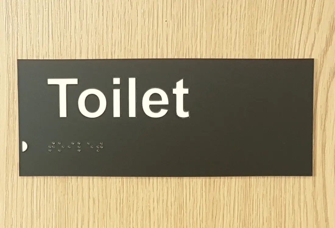
Braille
Wayfinding in complex public spaces should always include braille. Spaces include retail centres, museums, galleries, public transport hubs, and airports. Use colour differentiation to make it clear to visual readers where the braille is located. This way, braille readers can be easily directed to the signage that they require. Braille signage should be positioned between 48” and 60” from the ground, and should be on the latch side of the door. Braille is a system of writing, not a language. As such, busy international environments such as airports benefit from braille in multiple languages, as well as tactile pictograms for full inclusivity. It’s important to note, however, that most people with visual impairment cannot read braille, and many are reluctant to touch tactile signage in public places for hygiene reasons since the pandemic, so braille should never be your sole means of engaging with visually impaired and blind users.
Communicating your brand
As with all signage, always use wayfaring signage to communicate your brand identity and image. By choosing to make your signage inclusive, you are already sending a powerful message to your audiences regarding the importance of safety, support, and accessibility. However, attention to the details can take this one step further. For instance, the choice of tactile experience can convey values such as luxury, ecological sensitivity, or playfulness. As such, wayfinding signage can be used to engage with multiple audiences on a very deep and meaningful level, encouraging both trust and loyalty.
What next?
If you want to explore the options for accessible wayfinding signage, or are interested in discovering how it can enhance your brand appeal, download our free guide today or get in touch!

Image source: Canva