Our Blog

Subscribe to our blog
Search
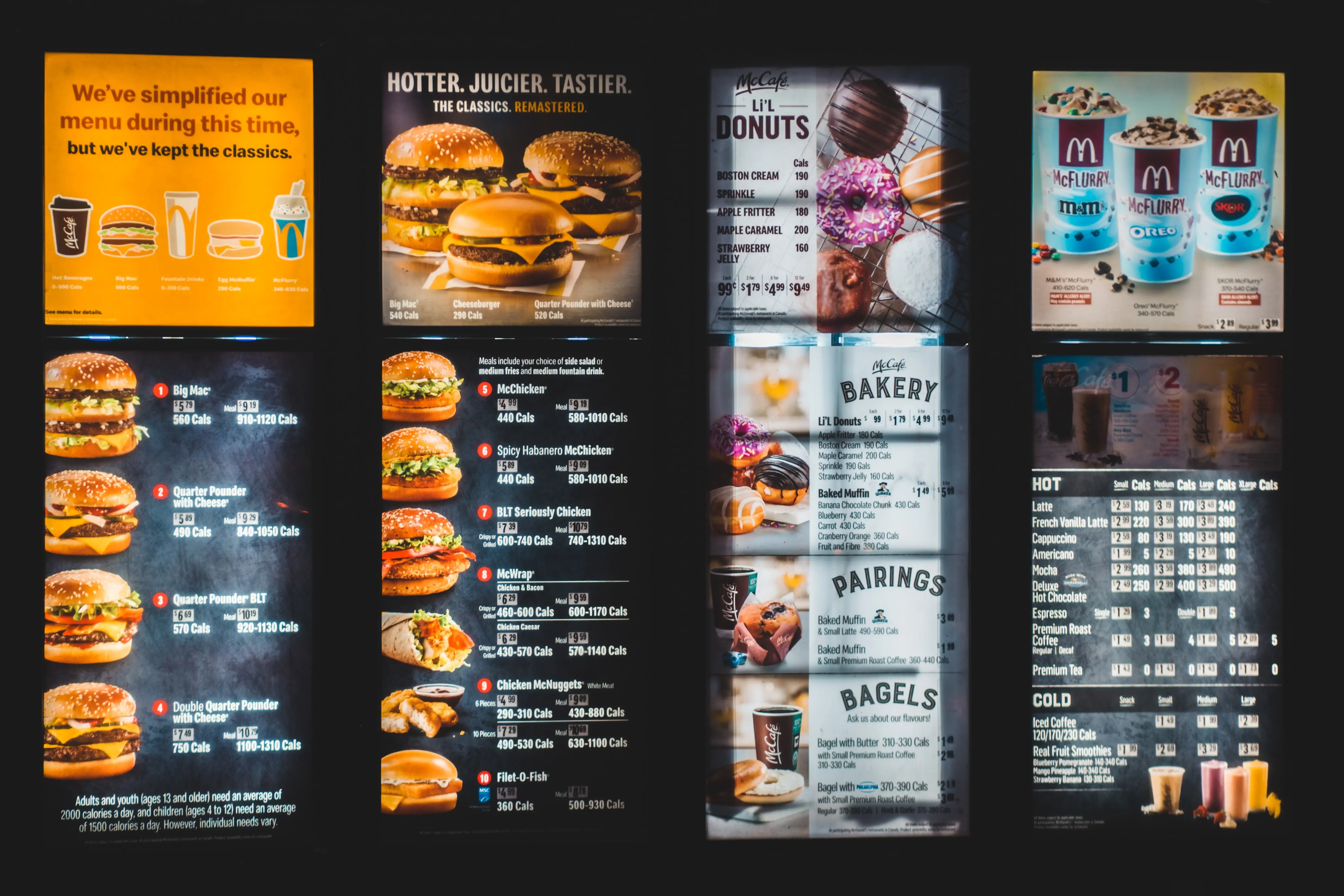
Many restaurants and cafes are introducing digital menu boards to replace old-fashioned card or paper versions. As well as strongly conveying a sense of innovation - which is always welcomed by customers - digital menu boards enable staff to quickly make amendments, for example changes in price, temporary discounts or offers, or out of stock items. Staff don’t have to spend unreasonable amounts of time printing off new hard copy menus and customers don’t face the frustrating situation of being told that a particular dish is unavailable at the point of ordering.
At Image Technique, our specialist digital graphics team can design and create bespoke menu boards that reflect the ethos and theme of your eatery. Having easy-to-maintain software and hardware means any team member can quickly make changes in the fast-paced catering environment, improving the customer experience and strengthening your business’s customer service.
Digital menu board screens work best if you follow these simple strategies:
1) Keep It Simple
You may think that a menu featuring an inordinate number of menu choices may be exactly what customers crave but, where digital boards are concerned, simplicity is the best option! With fewer choices, customers have less time to stand around deliberating, so long queues are less likely to form (which can be off-putting for others). A confusing menu may also discourage people from even ordering if they don’t understand the options, so create a menu board that is easy-to-read, with items arranged into categories, and set out in columns and rows for simplicity.
2) Choose An Easy-To-Read Font
Many catering businesses choose a font that reflects the ethos or theme of their company when creating Digital signage, but this is a less sensible decision when designing a digital menu board. Overly elaborate fonts can be difficult to read and, for customers who simply want to choose their dishes and make a quick exit, this can be incredibly frustrating for them. Instead, keep to simple fonts that are easy-to-read and uncluttered, such as Arial, Helvetica, or Trebuchet.
3) Remember How Customers Read
According to research by Cornell University, customers tend to spend three seconds looking at the first promotion on a menu board before reading the rest of the screen sequentially, from left to right, like a book. This affects how a digital menu board should be organised: promotions, for example, are best positioned in the top right-hand corner to gain maximum visibility. Menu boards with moving screens may be fun, but they are difficult to read, so keep the information static and simple so customers can peruse without being hurried along.
4) Only Use Professional Images
When selling food, appearance counts. Poorly presented dishes are unattractive and unlikely to yield repeat custom so, while it’s a great idea to include photographs on your digital menu board, there is little to be gained by using substandard images. Only choose high-quality professional images and avoid cluttering the menu when adding them. If the menu looks confusing or untidy when images are uploaded, it may be best not to use them at all.
Contact Us For Expert Help and Guidance
If you’d like to find out more about how Image Technique can help your catering business with creating attractive digital menu boards, please contact us today on 01527 578533.
Image Source: Unsplash


